Mangage Your Wardrobe
we seek to mangage your wardrobe by offloading the tasks of wardrobe management and selection into a digital service that aids everyone who uses it so they can focus on the rest of life while keeping their fashion fresh and updated.
Clik here to see final Prototype: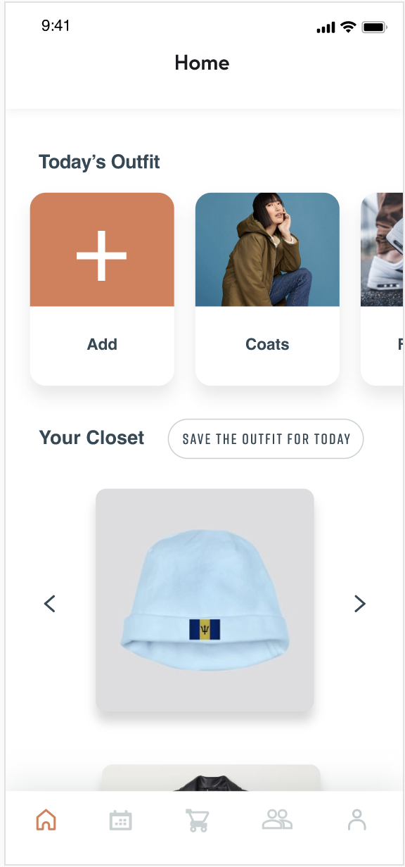
Solving daily probelms
There are problems to be solved all around us. Common, everyday occurrences that have been so integrated into our daily lives that we hardly notice the trouble they cause or think to seek a solution for them.
If you were to stop a person on the street and ask about the specifics of their wardrobe, it’s unlikely they could answer anything but the most basic of questions. It is also very possible that they have forgotten about a lot of items they own. This can lead to the purchase of new items without realizing just how many items are in the back of their closet, hardly worn.
To adress these probelms, we decided to design a mobile application called Closet Buddy to help people manage their wardrobes.
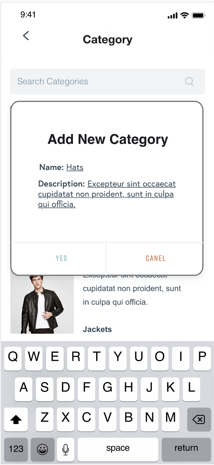
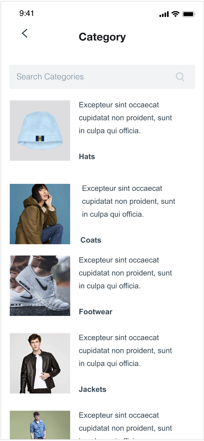
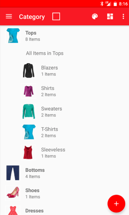
Add a new category into the Closet Buddy, view the category in the category list.
Design Challenge
Here is an example of how we would imagine this application being incorporated into a user’s daily routin.
At home:
- X wakes up and launches the app.
- X sees an auto suggested outfit.
- X decides they like the pants but does not feel like wearing that shirt today.
- X swipes right to browse through tops.
- X long presses on the shirt card to pull up filters
- selects ‘blue’ + ‘t-shirt’ + ‘work’ in order to filter for appropriate items.
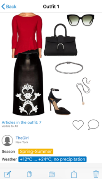
- X is presented with options and makes their decision by adding the item to their outfit.
- X confirms the outfit for the day.
In Store
- X is shopping in their favorite store.
- X finds a shirt they really like.
- X thinks there is a chance that they already have a Black V-Neck T-Shirt.
- X launches the app, and clicks on the t-shirt database.
- X searches filters like ‘black’ + ‘t-shirt’ → X sees that they do have a black t-shirt but it is not a v-neck.
- X makes the decision on whether they would like to purchase the item based on the given info.
My role
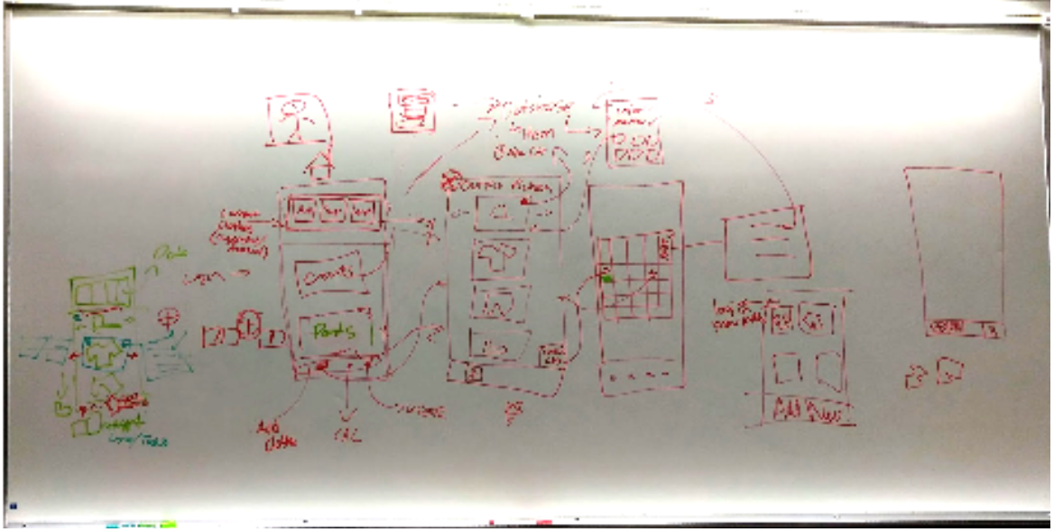
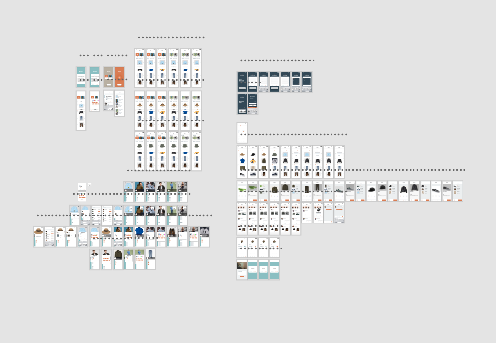
Closet Buddy is a five-person project, and I am responsible for making all the prototyping. At the beginning stage of the project, I participated in the ideation of the design. In wave 2 of the project, I started to make basic prototyping for my team to do user testings. In the last wave of the project, I modified the prototypes based on the feedback I received from my team members and user testing forms.
Wave 1
To begin the design process, we started by analyzing the problem space. Early on we began analyzing other existing applications that offer similar services. Considering that we want to create a robust and intuitive user interface, we analyzed the difference from different UI’s and made observations about the user experience.
YourCloset (https://www.yourclosetapp.com/) is one of the simpler applications we’ve analyzed. The UI is plain and has a generic layout, so if the user has several apps on their phone they wouldn’t have any issues with this. Our main issue with YourCloset is how limited the users are when it comes to the onboarding process. Users can only input clothes into the app via the camera, which can be cumbersome for larger wardrobes. For that reason, we hope to include a variety of options so that users can decide to onboard items in whatever way they find easiest. Some might choose to use their camera in order to get the most accurate image of their item while others might choose to just search up the item as it appears in the online store.
GetWardrobe (https://en.getwardrobe.com/) is a visually better application. It does a lot of things better than most other applications we’ve reviewed, specifically the number of options users have when it comes to choosing and sorting through their wardrobe. In fact, it gives the users too many filters to apply to their wardrobe which ends up increasing the amount of mental effort that the user would have to exert. Our strategy is to create an informed UI that we help users navigate options easier. Overall, the main features we want to focus on are giving users multiple ways of cataloguing their wardrobe, a calendar feature that users can integrate into other calendars and a feature that provides recommendations based on weather, location, etc. Another design choice we’ve chosen is to make and visually build the app to be gender neutral as most of the apps we’ve seen are catered exclusively to women. We want to build a general lifestyle application.
Furthermore, we must consider the limitations of human cognition. For example, we are only able to focus on a select amount of items at a time and attention can shift very quickly. For this reason, we must consider which information is the most important at any given stage. We will attempt to create a simple interface to avoid visual cluttering. Next, our whole system is based on offloading human memory. As we have learned, users can recognize much easier than they can recall. This is why we have moved the wardrobe to a virtual representation so that they do not have to recall their wardrobe when they are in a store. Since one of our problems is that we tend to forget certain items of clothing, the app will store and potentially offer all items in the hopes of avoiding lost clothing.
Finally, we began a user survey. This will be sent out with the goal of understanding how a user functions on a given day, how they feel about the current state of their wardrobe and what features they would consider to be necessary or not.
Wave 2
For this iteration, we all began by making sure we all understood the app and its core functionality. Next, we were tasked with creating a paper prototype each. We felt that this would be a good way to flush out ideas, since we all might have a slightly different vision in our heads. Finally, we split up the digital prototype and the report. David analyzed everyone’s paper prototypes and combined them into an initial digital prototype. Rollin, Nikhil, Ruby and Sara began looking into methods we could use to prepare our digital prototype for user testing. After the first version of the digital prototype was created, we went through a group walkthrough and discussion to make sure that the user journey made sense. When we were all happy with it, David implemented the new ideas and Rollin and Sara worked on the report.
Reflection
As a team, we learned to start user testing earlier in the future. We may have made a lot of assumptions on features we felt were obvious or ones we felt were important. User testing showed us where we need to pay more attention, and where we need to pay less. During this stage we also learned that it is necessary to make some tough decisions, as with the number of items to display. However, in the end, it is our job to make these calls so that our users can have the best experience possible.